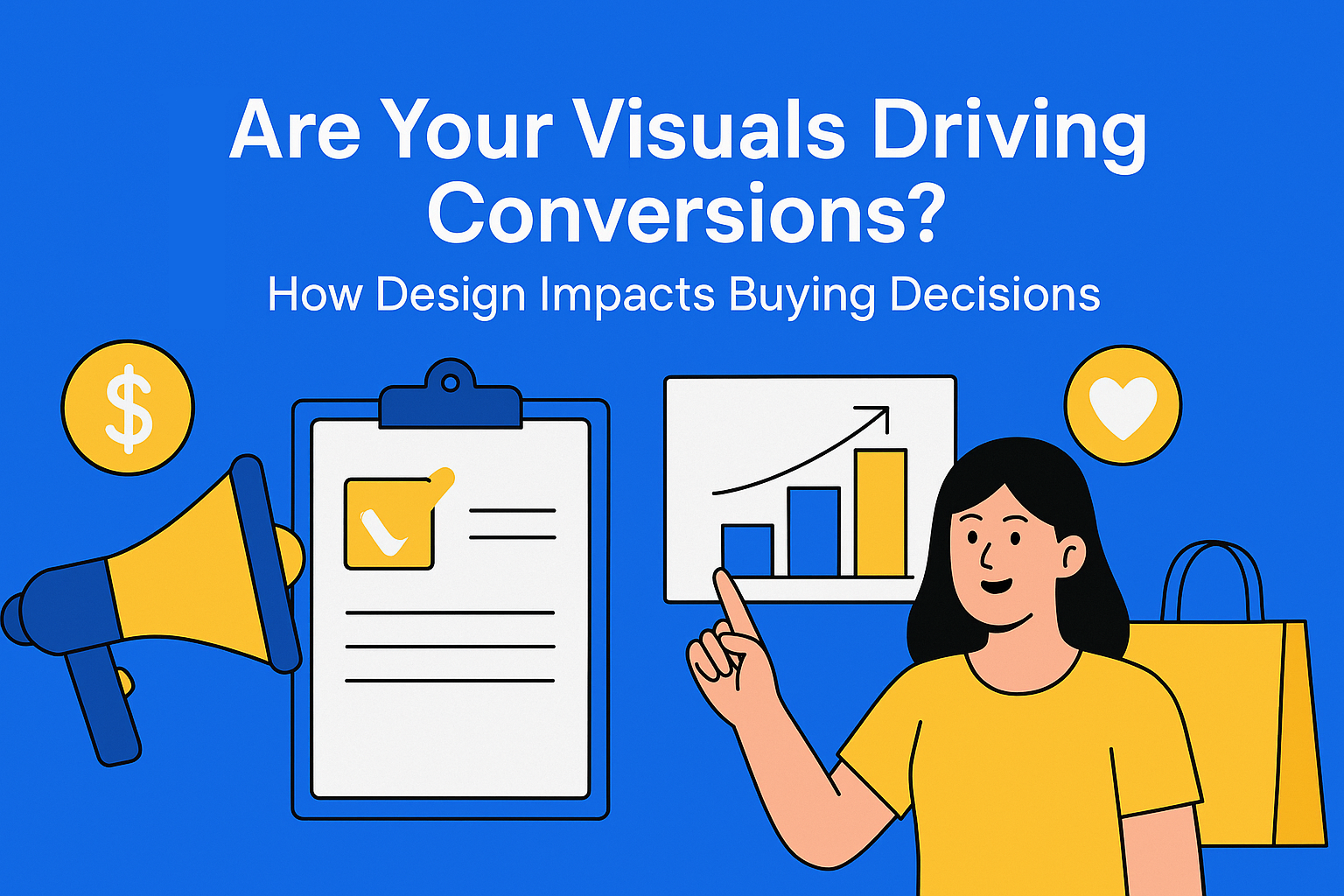
Are Your Visuals Driving Conversions? How Design Impacts Buying Decisions
Great visuals don’t just decorate - they convert. Discover how smart design builds trust, directs attention, and boosts buying decisions. If your visuals aren’t working hard, you’re leaving conversions behind.
Key Takeaways
- Design influences first impressions – a clean, cohesive layout instantly builds trust and credibility with your audience.
- Colors trigger emotion – smart use of color (like blue for trust or red for urgency) subtly guides user feelings and actions.
- Layout directs attention – clear visual hierarchy ensures that CTAs, headlines, and key messages stand out.
- Poor visuals hurt conversions – low-quality images, messy layouts, and off-brand visuals push users away, no matter how strong your copy is.
- Great design boosts clarity and engagement – every visual element should support the core message and improve the experience.
- Visuals shape perceived value – polished, consistent visuals make your brand feel premium and trustworthy.
- Consistency protects brand identity – centralized systems like EasyContent help enforce visual standards across all channels.
- Testing improves design decisions – A/B testing visuals reveals what truly drives conversions—not just what looks good.
When it comes to content marketing, we often obsess over headlines, copy, and keywords. But here’s a truth many teams overlook: design can make or break a conversion. No matter how great your message is, if the visuals feel off (untrustworthy, confusing, or generic) you’re losing potential customers before they even finish reading.
Visuals do more than make your content look nice; they influence how users feel and what they do next. Design affects credibility, perceived value, and even buying decisions. In this post, we’ll break down why visuals matter so much, the psychological triggers behind great design, and practical tips to make your visuals work as hard as your words.
Why Design Shapes Decisions (More Than You Think)
People are visual creatures. Studies show that people process visuals 60,000 times faster than text. That means your audience is forming an opinion about your brand before reading a single word.
Here’s how design impacts the buying journey:
- First impressions build trust
A polished, cohesive look signals professionalism. A cluttered layout or mismatched visuals screams inconsistency, and inconsistency breeds doubt. - Colors evoke emotion
Blue conveys trust, red creates urgency, green suggests growth or health. The right color scheme subtly influences how visitors feel - and act. - Layout guides attention
Where your eye goes first isn’t random. Strategic design can draw attention to your most important elements, like CTAs (call-to-actions) and key product details.
In short: people don’t just read content - they experience it. And the way you present that experience determines whether they click, scroll, or leave.
The Psychology Behind Conversion-Driven Design
Let’s look at some key psychological principles that explain why visuals influence decisions:
1. Color Psychology
Colors aren’t just aesthetic - they’re emotional triggers. For example:
- Blue = Trust, reliability (why so many banks use it)
- Red = Excitement, urgency (think clearance sales)
- Green = Growth, health, calmness (great for wellness brands)
2. Visual Hierarchy
Your layout should lead the reader’s eye in a clear, intentional path:
- Headline → Supporting text → CTA
- Use size, color contrast, and spacing to make CTAs pop without being overwhelming.
3. Social Proof in Design
Showing customer reviews or testimonials with visuals—stars, profile images, badges—feels more credible than text alone. Visual confirmation of trust matters.
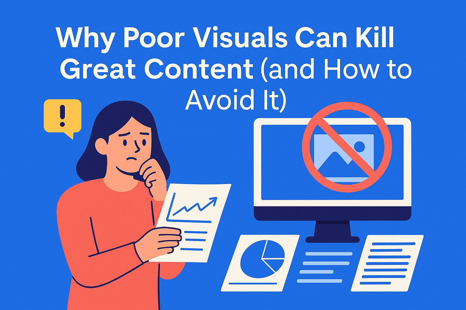
Common Visual Mistakes That Kill Conversions
Even the best content can flop when paired with poor design choices. Here are the usual suspects:
- Low-quality or stretched images → Signals unprofessionalism instantly.
- Stock photo overload → Audiences can spot generic imagery a mile away.
- Cluttered layouts → Too many elements compete for attention, leaving users confused.
- Inconsistent branding → Mismatched fonts, colors, and tone make your brand look scattered.
The solution? Design with intention. Every image, font, and color should have a purpose: to make your message clearer and your offer more compelling.
Actionable Tips to Make Your Visuals Drive Conversions
Ready to level up your design game? Here’s how:
1. Align Visuals With Your Brand Voice
Your colors, fonts, and imagery should match your overall brand identity. If your tone is playful, choose vibrant colors and friendly visuals. If it’s professional, stick to clean lines and minimal design.
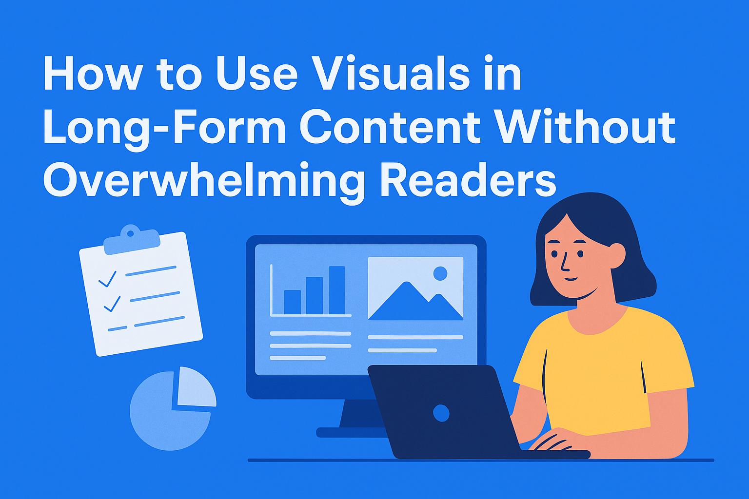
2. Use Visuals to Break Up Text
Long walls of text overwhelm readers. Add:
- Infographics to simplify complex ideas
- Images or icons to illustrate examples
- Whitespace to give the eye a break
3. Optimize CTAs Visually
Your call-to-action should stand out. Use:
- Contrasting colors to grab attention
- Strategic placement (near the end of a section, above the fold)
- Clear design cues like buttons, not just hyperlinked text
4. Test Different Visuals
Don’t guess what works - test it. A/B test different color schemes, layouts, and image styles. What you think looks best might not perform best.
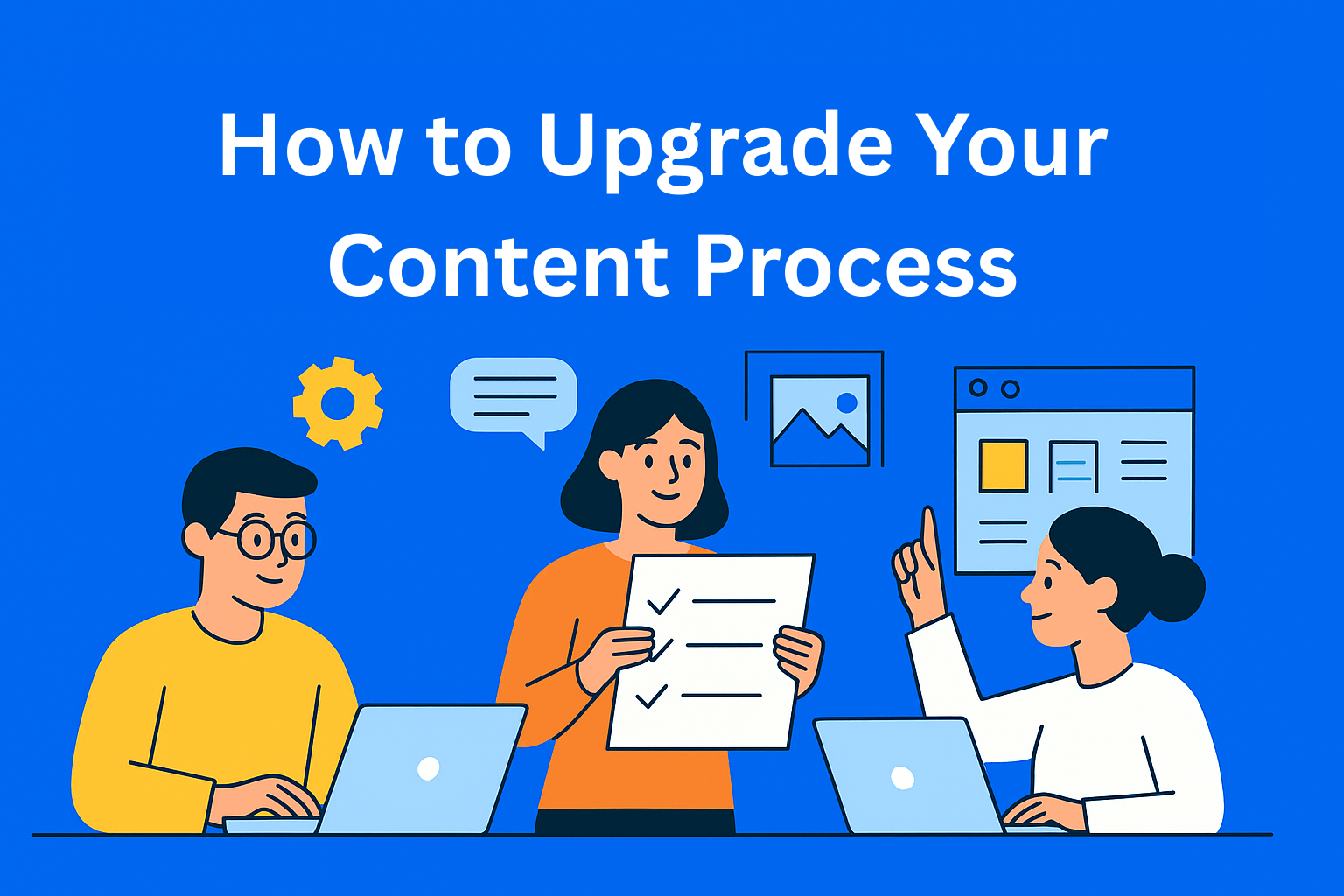
5. Centralize Your Visual Strategy
If your team struggles to stay consistent across multiple campaigns, centralizing assets is a game-changer. With EasyContent, you can store all your approved visuals in one place, attach them to content pieces, and even include brand tone and design rules in project templates. No more digging through email threads or guessing which logo version to use.
How EasyContent Helps Keep Visuals Consistent
Most visual inconsistencies happen because teams use scattered tools - Google Drive for images, email for approvals, and random spreadsheets for tracking. With EasyContent, everything lives in one organized system:
- Upload and store approved images, icons, and videos.
- Add visual guidelines to documentation and templates.
- Create custom workflows so design approvals never bottleneck content production.
The result? Consistent, on-brand visuals across every piece of content, every time.
Conclusion
Great design isn’t decoration - it’s strategy. The right visuals:
- Build trust
- Guide attention
- Boost engagement
- Drive conversions
If you’re investing time in writing amazing content, don’t let bad visuals ruin it. A polished design makes the difference between “just another blog post” and content that converts readers into customers.