How Designers and Content Writers Can Collaborate to Create Better Prototypes with Real Content
Designers and content writers often work separately, leading to misaligned prototypes. Using real content from the start improves design, user experience, and collaboration. Tools like EasyContent streamline teamwork and speed up the entire process.

When Design and Content Don't Match
Think about this: It can take weeks for a UX designer to carefully create a sleek, modern website style. But then the content team adds text that doesn't quite fit. The headlines are too long, the buttons too small for the call-to-action, and soon the whole design feels uncomfortable. When content and design teams operate in silos, irritation, last-minute corrections, and a disjointed end product result.
Content and design have been handled for far too long as distinct processes, with designers emphasizing aesthetics and authors working alone. Actually, though, they should cooperate from the very beginning. When design and content line up, the finest user experiences result from a flawless journey that not only looks fantastic but also conveys the correct message in the proper manner.
📌 Key Takeaways
- Early collaboration between designers and writers leads to better alignment and fewer last-minute fixes.
- Real content used in prototypes improves layout accuracy and user experience testing.
- Avoid using placeholder text like Lorem Ipsum—it causes unrealistic expectations and layout mismatches.
- Tools like Figma and EasyContent streamline communication and real-time feedback.
- Shared style guides and content libraries help maintain brand consistency across platforms.
- A structured workflow ensures that both content and design evolve in sync, reducing back-and-forth and delays.
The Common Disconnect Between Designers and Content Writers
The communication breakdown between designers and content writers is one of the toughest obstacles in digital initiatives. Often working with placeholder language like "Lorem Ipsum," designers assume material will fit precisely afterward. Writers battle to create engaging text that fits the design limitations they have little control over.
As such, a back-and-forth cycle of time- and effort-consuming changes, corrections, and compromises begins. Teams that try to glue things together at the end risk usability problems and mismatched branding, instead of producing a coherent experience.
Why Real Content in Prototypes Improves User Experience
Early in the design phase, real content used in prototypes helps to prevent these issues. Teams can organize materials to fit naturally into layouts, ensuring everything flows well from the beginning instead of building around fictitious text. This approach allows:
- Better readability and engagement – Users process content more effectively when it’s designed with real headlines, copy, and CTAs.
- More accurate testing – Prototypes with actual content allow teams to gauge user reactions and make improvements before launch.
- Smoother collaboration – Writers and designers can give real-time feedback, avoiding miscommunication.
Platforms like EasyContent help bridge this gap by offering a centralized hub where designers and writers can collaborate seamlessly. Instead of managing content through endless email threads or scattered documents, teams can store, edit, and approve real content within a structured workflow. This means that by the time a design reaches the prototype stage, the words and visuals already work in harmony.
The Problem with Placeholder Content: Why “Lorem Ipsum” is Hurting Your Designs
Should you have ever worked on a website or app design, you most likely came across "Lorem Ipsum" placeholder text. For years, designers have turned to this filler as it lets them concentrate on aesthetics without worrying about content. Though it might appear harmless, using placeholder text can actually cause more problems than it solves: unrealistic designs, last-minute content chaos, and ultimately, a poor user experience.
Why Using Lorem Ipsum Creates Unrealistic Designs
At first glance, Lorem Ipsum seems like a convenient shortcut. The issue is, placeholder text doesn’t reflect real content length, structure, or complexity. Headlines might be longer than expected, body copy could be more detailed, and calls to action might require a different layout altogether.
Imagine designing a clean landing page with perfectly aligned text boxes, only to realize the actual content spills out and breaks the layout. This forces last-minute fixes, disturbs the visual harmony, and complicates things for both writers and designers.
The Chance of Mismatched Layouts and Last-Minute Changes
A big problem with placeholder text is that it gives a false sense of completion. Teams may approve a design assuming real content will just fit later. But when real content arrives, nothing fits as expected.
- Headlines may be too long or too short
- Call-to-action text might not fit in buttons
- Body copy could require restructuring layout and spacing
All of this leads to wasted time, conflicts, and a stressful scramble to either adjust the design or edit the content to make it work.
Placeholder Content Hurts Your Brand
Beyond layout issues, placeholder text damages brand clarity and consistency. It ignores critical elements like tone, messaging, and style, resulting in an uneven user experience.
- Poor readability – It doesn’t match real reading patterns, so you can’t assess text hierarchy or flow
- Lack of user testing – Users don’t respond the same way to gibberish as they do to real content
- Brand inconsistency – Placeholder strips out your voice and identity, delaying key content decisions
A Smarter Way: Use Real Content in Prototypes
So how do you avoid all this? Simple: use real content early. Teams can start content production and reviews in tools like EasyContent before the design is finalized. Instead of relying on Lorem Ipsum, writers and designers can collaborate in one place, ensuring the actual language fits the design from the start.
By replacing filler text with structured, on-brand content, teams can:
- Build more accurate prototypes
- Speed up approvals
- Deliver a better overall user experience
Sometimes, a small change—like using real content—can make a big difference.
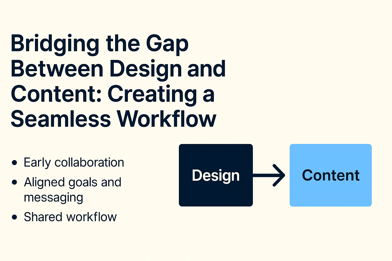
Bridging the Gap Between Design and Content: Creating a Seamless Workflow
You understand how annoying it may be if you’ve ever worked on a project where authors and designers were not in sync. Either the designer creates a layout that doesn't match the messaging, or the writer delivers content that doesn’t fit the design. The result? Last-minute changes, endless corrections, and a broken user interface.
Early and frequent collaboration between designers and content creators can prevent this chaos. The entire process runs more smoothly when they start with aligned goals, audience insights, and clear messaging. Let’s explore how to close this gap and create functional, user-friendly prototypes.
The Importance of Early Collaboration
Too often, designers and writers work in silos—designers focus on aesthetics, while writers focus on messaging. But content and design are not separate—they work together to guide users and tell a compelling story.
A great design can’t save poor content, and even the best content won’t shine if the layout doesn’t support it. That’s why collaboration should begin early, before wireframes or drafts. When aligned on strategy, designers and writers can create layouts and copy that complement—not compete.
Example: Imagine an e-commerce landing page. If the designer builds a minimalist layout expecting short product blurbs, but the content team delivers detailed descriptions, the result will be cluttered and unbalanced. Early conversations could have avoided this mismatch.
Aligning on Goals, Audience, and Messaging
Before diving into design or content, both teams should clearly define:
- Who the audience is – What do users need, and how will content + design serve them?
- What’s the core message – What should the design reinforce?
- CTA style and placement – Should the call to action be subtle, bold, or interactive?
Early alignment ensures the team builds a cohesive, user-centered experience, not one patched up in revisions.
Establishing a Shared Workflow to Avoid Miscommunication
A structured workflow keeps things on track and minimizes endless revisions. Instead of working in isolation and merging at the last minute, teams should follow a collaborative process:
- Kickoff meeting – Align on goals and content needs before design begins
- Content-first or parallel creation – Decide together how to approach creation
- Feedback loops – Use real-time collaboration tools to refine in tandem
How EasyContent Helps
Platforms like EasyContent streamline the entire process by offering a centralized space where teams collaborate in real time.
- Writers can draft content while
- Designers build layouts — all in one place.
- Integrated feedback, approvals, and role-based access keep things organized and on track.
This ensures that by the time a prototype is finalized, content and design are already in sync—no need for emergency fixes or chaotic back-and-forths.
How to Integrate Real Content into Prototypes
Treating content as an afterthought in product and web design is one of the biggest mistakes. Teams often build wireframes with Lorem Ipsum or vague placeholders, only to realize later that real content doesn't fit the layout. The result? Last-minute fixes, messy layouts, and a frustrating back-and-forth between designers and writers.
The solution: Use actual content from the start. Prototypes created with real headlines, navigation labels, and CTA text naturally align design and messaging. Here’s how to do it:
Use Wireframes with Actual Headlines and Text Instead of Filler
Wireframes are great for outlining layout, but using dummy text is a missed opportunity. Instead of "Lorem Ipsum," use real, strategic content—even if it’s just a rough version. It helps you check if the design supports the message, or if changes are needed.
Example: You’re designing an e-commerce product page. If the wireframe uses a short placeholder like “Product Name,” but actual titles are longer, you'll face overflow issues. With real content early on, you avoid those problems and build a layout that actually works.
Test Different Content Lengths for Better Layout Flexibility
Content varies. Some headlines are short and sharp, others are longer and descriptive. Descriptions may be quick blurbs or full paragraphs. To ensure the design is adaptable, test different content lengths during the prototype phase.
Try examples like:
- A short, snappy headline: "5 Hacks for Better Sleep"
- A longer one: "Struggling with Insomnia? Here Are 5 Simple Hacks to Improve Your Sleep Cycle"
If your layout can handle both, it’s flexible. If not, it needs tweaking before launch.
Structure Content to Match Design Elements
Great UX is not just about looks—it’s about how users understand and interact with the content. That’s why content should be tailored to fit key design elements, like:
- CTA buttons: Use actionable text like “Get Started” instead of generic “Click Here”
- Navigation labels: Make them clear and intuitive
- Forms: Provide explicit instructions, e.g., “Enter your email for exclusive updates”
When content and design align, usability improves, and the experience feels intuitive.
How EasyContent Simplifies the Process
Managing content and design separately is often chaotic, especially with multiple team members. That’s where EasyContent comes in. Instead of juggling Google Docs, emails, and spreadsheets, teams can centralize everything in one place.
With EasyContent:
- Writers can draft headlines, CTAs, and product descriptions inside a structured workflow
- Designers get access to real content before implementation
- The built-in approval system ensures nothing gets lost in long email threads
Tools That Help Designers and Writers Work Together
Easy collaboration between designers and writers produces a polished, user-friendly experience. However, poor tools can lead to messy processes and miscommunication, slowing everything down.
Ever chased approvals and comments through endless email threads? Yep—we’ve all been there.
Thankfully, real-time collaboration tools have changed the game, allowing teams to work effortlessly together. Here are some of the best tools to help bridge the gap between content and design, ensuring consistency and efficiency.
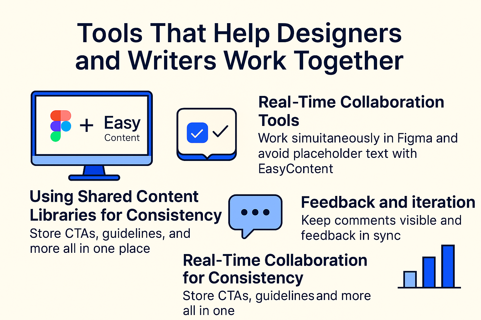
1. Real-Time Collaboration Tools: Figma and EasyContent
A major challenge is working in silos—designers in one tool, writers in another. Somehow, they have to make it fit together. That’s where tools like Figma and EasyContent come in.
- Figma: A favorite among designers, it allows real-time collaboration on the same file. Writers can insert real content into prototypes, avoiding placeholder mismatches and ensuring the layout actually works with real-world content.
- EasyContent: While Figma handles visual design, EasyContent keeps the writing process organized. It centralizes content planning, drafts, and approvals, letting writers provide final content before the design phase even starts.
No more last-minute text changes that disrupt the layout—teams stay aligned from the beginning.
Together, these tools ensure writers and designers stay on the same page—literally.
2. Using Shared Content Libraries for Consistency
Ever seen a CTA button that says one thing on the homepage and something different on a landing page? That kind of inconsistent messaging confuses users and weakens brand identity.
Shared content libraries help maintain uniformity across platforms.
A solid content library includes:
- ✅ Pre-approved CTA phrases ("Get Started", "Learn More")
- ✅ Brand voice and tone guidelines
- ✅ Reusable descriptions and key messaging
With a tool like EasyContent, teams can store everything in one place, so both writers and designers pull from the same source—saving time and avoiding errors.
3. Feedback and Iteration: Keeping Teams Aligned
Let’s be honest—feedback loops can be a nightmare. Designers and writers often work separately, so feedback gets lost, and changes are made in isolation.
The result? A frustrating back-and-forth that slows down delivery.
To prevent this, teams should use tools that keep feedback visible and centralized.
- In Figma, comments can be left directly on the design, helping spot issues and suggest edits in real time.
- EasyContent manages feedback on written content, letting editors and strategists review and approve without endless emails.
When feedback is integrated into collaboration tools, teams avoid chaos and keep the workflow smooth and efficient.
Best Practices for a Seamless Workflow
When designers and writers work together efficiently, the result is a well-structured, visually appealing, and engaging user experience. But without a clear process, things can quickly become chaotic—last-minute text changes, design inconsistencies, and a frustrating back-and-forth between teams.
To avoid the mess and create a seamless workflow, here are some best practices that help content and design teams stay aligned and productive.
1. Set Clear Roles and Responsibilities
One of the biggest causes of confusion in content workflows? Overlapping responsibilities and unclear expectations. Who writes the microcopy? Who decides if a heading should be shorter? Who has the final say in button text? If these aren’t defined upfront, teams waste time debating details instead of moving forward.
To keep things smooth, establish who does what from the start:
✅ Writers handle long-form content, headings, CTAs, and microcopy
✅ Designers structure layouts around the content, ensuring readability
✅ UX specialists ensure that the content and design work together seamlessly
✅ Project managers oversee deadlines and approvals
Having clearly assigned roles prevents duplicate efforts and last-minute fixes, keeping the project on track.
Pro Tip: Use a content management platform like EasyContent to assign roles, track progress, and keep everyone in sync. This way, everyone knows what’s expected of them without unnecessary back-and-forth.
2. Create a Unified Style Guide
Design teams have brand guidelines, color palettes, typography rules, and spacing requirements. Content teams have tone and voice guidelines—word choices, sentence structures, and grammar rules. But often, these guides are separate, leading to inconsistent messaging and formatting across projects.
The best solution? Combine both into one comprehensive style guide that covers both content and design rules so that:
✅ Writers understand how much space they have for copy
✅ Designers align text styling with brand voice
✅ Everyone follows the same formatting rules for consistency
For example, if your brand uses short and punchy headlines, but the designer makes room for a long headline, there’s a mismatch. A shared style guide avoids these conflicts before they happen.
EasyContent helps teams store and maintain style guides in one central place, ensuring that everyone works with pre-approved guidelines instead of guessing what fits best.
3. Run Usability Tests with Real Content
The most common mistake in design and content workflows? Waiting until the last minute to add real content. Many teams design layouts with Lorem Ipsum, only to realize later that the actual text doesn’t fit. This leads to rushed copy edits, awkward text breaks, and frustrating revisions.
To avoid this, teams should:
✅ Use real headlines, descriptions, and CTAs during the wireframing stage
✅ Test different content lengths to see how flexible the design is
✅ Get feedback from real users to identify readability and clarity issues
By testing prototypes with actual content, teams ensure that the final product is user-friendly, well-structured, and doesn’t need last-minute changes.
Real-World Example: Imagine a checkout page design that looks great with Lorem Ipsum, but when real product descriptions are added, the layout breaks. If tested early, the design could have been adjusted upfront to fit actual content.
The Role of EasyContent in Content-Design Collaboration
In the realm of digital material, designers and authors have to cooperate effortlessly to produce interesting, user-friendly encounters. To be honest, though, things rarely happen perfectly. While designers could arrange pages with placeholder text, only to discover later that actual material does not fit, content writers might create extensive paragraphs that violate a design layout. This back-and-forth can slow down initiatives, result in pointless corrections, and irritate both parties.
This is where EasyContent comes in. It’s not just another content tool—it’s a collaboration hub that keeps writers, designers, and other stakeholders in sync throughout the content creation process. Here’s how it helps bridge the gap between content and design.
1. Organizing and Structuring Real Content from the Start
One of the biggest mistakes teams make is using placeholder text (Lorem Ipsum) instead of real content in the early design stages.Later on, real text usually causes designers to go back and change everything as the layout typically collapses. EasyContent solves this by giving designers and content creators a controlled environment from which to work from day one.
✅ Writers can draft, store, and structure content in a central place
✅ Designers can see real content early on and adjust layouts accordingly
✅ Teams can test different content lengths to ensure flexibility in design
By integrating real content before the final design is set, teams avoid last-minute revisions and ensure that everything fits perfectly.
💡 Example: Imagine a marketing team creating a landing page for a new product. Instead of designing the page first and scrambling to fit in copy later, EasyContent allows writers and designers to collaborate in real time, ensuring the content flows naturally within the design framework.
2. Streamlining Feedback and Approvals Between Teams
Another common challenge in content-design collaboration? Scattered feedback across multiple tools. Comments lost in long email threads, Slack messages buried under unrelated discussions, and approvals delayed because no one knows who has the final say.
EasyContent solves this with built-in review and approval workflows, making feedback clear, structured, and easy to track.
✅ Writers and designers can leave comments directly on content drafts
✅ Editors and stakeholders can approve changes without endless email chains
✅ Automatic notifications ensure no feedback gets overlooked
This way, teams can avoid confusion, speed up approvals, and ensure content is always aligned with design needs.
💡 Example: A content team is working on a new website redesign. Instead of sending Word docs and PDFs back and forth, all content edits, design feedback, and approvals happen within EasyContent—keeping everything organized in one place.
3. Ensuring Content Stays Aligned with Design Components
Even after content is finalized, keeping it aligned with the design can be tricky. Writers may update product descriptions or CTAs, but if designers aren’t informed, the final version on the website might not reflect those changes.
EasyContent ensures that content updates are tracked and communicated, so nothing gets lost in the shuffle.
✅ Version control prevents outdated content from being used
✅ Role-based access ensures the right people can edit or approve changes
✅ Integration-friendly system allows content to be synced across platforms
With everything in one place, teams can maintain consistency across content and design without constant back-and-forth updates.
Real Content for Better Prototypes and Collaboration
Great digital experiences are about how those two components interact rather than only about having a beautiful design or well-written content. Starting using actual material guarantees that prototypes are accurate, practical, and fit for user demands. Teams can prevent last-minute changes, odd layouts, and inconsistent messaging when design and content complement one another.
Designers and writers too frequently operate in silos, which results in a tiresome back-and-forth when it comes time to unite everything. Early and regular cooperation, however, helps the process to be lot more efficient, quicker, and smoother. Teams may create a united vision from the ground up instead of pushing material to fit into a pre-made design or last-minute layout modification to allow long-winded language.
Prioritizing Collaboration from the Start
Successful teams don’t just exchange files—they work together in real time, ensuring that both content and design evolve in harmony. Encouraging early collaboration between designers and writers means:
✅ Clearer messaging and storytelling—content isn’t just thrown in last-minute.
✅ Better design decisions—layouts are based on real-world content needs.
✅ Faster approvals and fewer revisions—eliminating unnecessary back-and-forth.
This approach saves time, reduces stress, and results in more user-friendly designs.
💡Imagine, for instance, a marketing team creating a product landing page. Should designers and writers collaborate independently, the final product can call for significant changes to accommodate content under strict design guidelines. If they work from the start, though, the page flows organically and guarantees both reading and visual attractiveness.
How EasyContent Helps Teams Work Smarter
Collaboration shouldn’t feel like a constant battle between content and design. Platforms like EasyContent make it easier for writers, designers, and stakeholders to work together without losing track of progress, feedback, or approvals.
✅ Centralized workspace—keep all content drafts, edits, and approvals in one place.
✅ Built-in review and approval workflows—no more scattered feedback.
✅ Real-time collaboration—ensure content and design stay aligned.
By streamlining these processes, EasyContent helps teams focus on what really matters—creating content that enhances the user experience.
Better Collaboration = Stronger, More User-Friendly Designs
At the end of the day, great content and great design are two sides of the same coin. A design that looks stunning but lacks meaningful content won’t engage users. Likewise, strong content placed in a poorly structured design won’t be effective. When teams break down communication barriers and start working together early, they create seamless, user-friendly experiences that truly resonate.
So if your team is still using placeholder text or waiting until the last minute to align content with design, it’s time for a better approach. Prioritize collaboration, use real content early on, and leverage tools like EasyContent to keep everyone on the same page.
By working smarter, not harder, your team can turn chaotic workflows into seamless, efficient processes—delivering high-quality content and designs with ease.