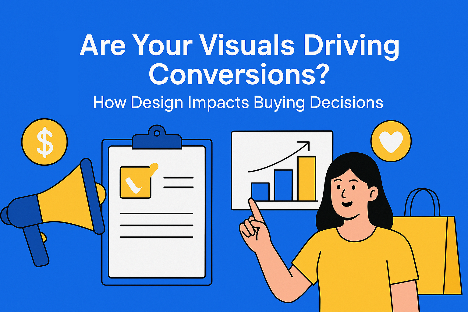
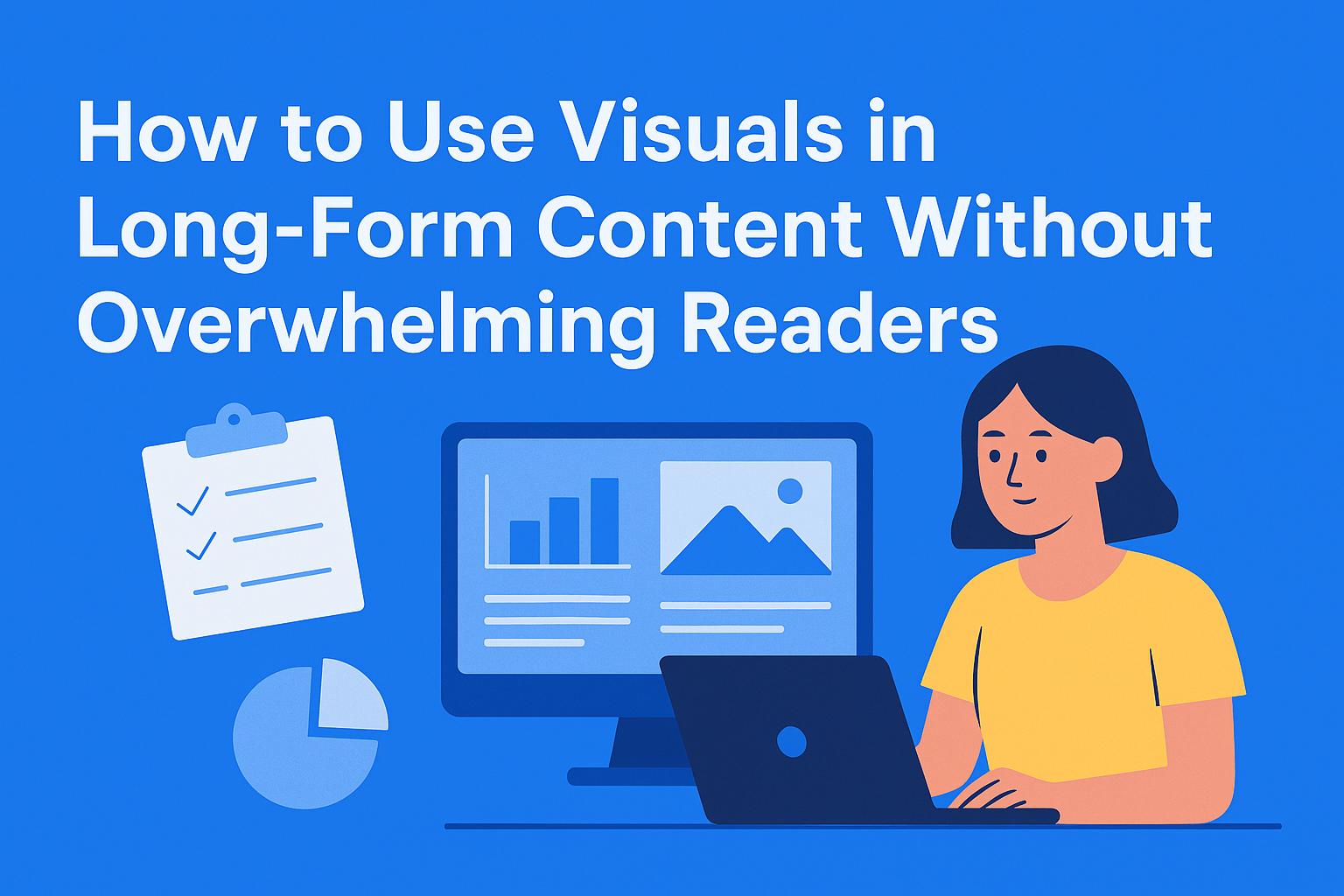
How to Use Visuals in Long-Form Content Without Overwhelming Readers
Great visuals make long-form content easier to read - but too many can overwhelm. Learn how to use images strategically to enhance clarity, keep readers engaged, and maintain a clean, professional look.
Key Takeaways
- Use visuals to enhance, not decorate – visuals should improve readability, clarify complex ideas, and boost engagement — not just fill space.
- Prioritize relevance over randomness – every image should support text, explain a concept, or show a real example.
- Place visuals strategically – include an image every 300–400 words, and place it near related content for better context and flow.
- Maintain consistency and balance – use uniform image sizes, a cohesive visual style, and brand colors to make content look polished.
- Avoid visual overload – too many images slow loading and distract from your message; only include visuals that add value.
Long-form content (blogs, whitepapers, and in-depth guides) is designed to inform and engage. But let’s be honest: staring at a wall of text for 10 minutes isn’t anyone’s idea of fun. That’s where visuals come in.
The right image can break up heavy paragraphs, explain a complex idea faster than words, and keep readers scrolling. But there’s a catch: too many visuals or poorly placed graphics can clutter your page and ruin the reading experience.
So, how do you strike the perfect balance? Let’s walk through practical ways to use visuals strategically - without overwhelming your audience.
Why Visuals Matter in Long-Form Content
Visuals aren’t just decoration; they serve a purpose. Here’s why they’re so important:
- Improved readability: Images, charts, and infographics break up text and make content easier to scan.
- Better comprehension: People process visuals faster than text. Complex topics become easier to understand with the right graphic.
- Higher engagement: Posts with visuals perform better across the board. They keep readers on the page longer.
The key isn’t about adding visuals for the sake of aesthetics - it’s about making them work for the story you’re telling.
The Golden Rule: Relevance Over Randomness
If a visual doesn’t serve a purpose, it doesn’t belong in your content. Stock images that feel generic? They add no value. Instead, aim for visuals that:
- Support the text - A chart showing data you just mentioned.
- Explain a concept - A diagram for a process you’re describing.
- Provide examples - Screenshots, real-life cases, or before-and-after comparisons.
Remember: if you can remove the image and the meaning of the text doesn’t change, that image probably doesn’t need to be there.
Where to Place Visuals in Long-Form Content
Placement matters just as much as the visuals themselves. Randomly dropping images into a post makes it feel chaotic. Here’s a good rule of thumb:
- Every 300-400 words - That’s roughly one image per screen scroll. It keeps readers from feeling like they’re drowning in text.
- Near relevant sections - Place visuals close to the point you’re explaining so readers instantly connect the dots.
- Above or below headings - This is a good way to break sections visually and signal a shift in topic.
Size and Consistency Matter
Visuals should look like they belong together. If one image is full-width and the next is tiny, your page feels messy. Keep it consistent by:
- Using the same image style (illustrations, photos, or a mix, but not random).
- Keeping image sizes uniform for a balanced look.
- Sticking to your brand colors in charts and graphics for visual harmony.
This isn’t just about aesthetics - it’s about making your content feel professional and easy to follow.
Avoid Visual Overload
Can you have too many visuals? Absolutely. Overloading your page with graphics makes it feel cluttered and distracts from the actual message. Signs you’ve gone too far:
- The text feels secondary to the images.
- The page loads slowly because of too many large files.
- Readers have to scroll endlessly past giant graphics.
A good test: if you removed half the visuals, would the content still make sense and look good? If yes, you probably have too many.
Practical Tips for Using Visuals Without Overdoing It
Here are some quick, actionable tips for your next long-form piece:
- Use visuals to simplify, not complicate. If it doesn’t clarify something, skip it.
- Mix it up. Combine photos, charts, and pull quotes to add variety without chaos.
- Compress images. Keep file sizes small for faster page load times.
- Add alt text. It’s good for accessibility and SEO.
- Plan ahead. Don’t scramble for images after writing - build them into the structure early.
Where EasyContent Fits In
If you’re managing multiple contributors, visual consistency becomes a real challenge. EasyContent makes it easier by:
- Storing all your visuals in one place so everyone works from the same library.
- Adding visual guidelines to templates so writers know what kind of images to use (and which ones to avoid).
- Keeping everything organized by project so you’re never hunting for the latest version of a chart or graphic.
That means less time chasing files and more time creating content that looks great and performs even better.
Conclusion
Visuals are powerful - but only when they’re intentional. A handful of well-placed, relevant images will always beat a page crammed with random graphics. The goal is simple: make your content easier to read, not harder.
So next time you’re planning a blog or whitepaper, think of visuals as your supporting cast - not the entire show. When done right, they’ll help your content shine without stealing the spotlight.