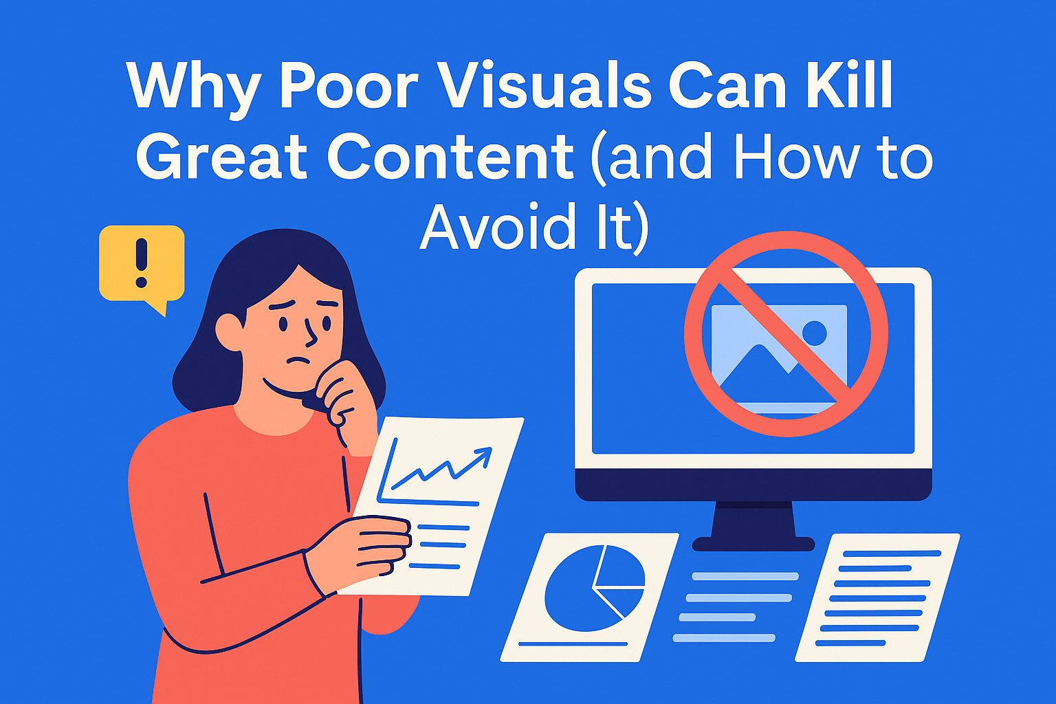
Why Poor Visuals Can Kill Great Content (and How to Avoid It)
Strong visuals make great content unforgettable. Poor ones? They ruin it. Learn the common mistakes and smart fixes to ensure your visuals elevate your message - not undermine it.
Key Takeaways
- Visuals shape first impressions – readers notice images before text, and poor-quality visuals can hurt trust and engagement.
- Bad visuals hurt performance – low-quality, generic, or off-topic graphics increase bounce rate and reduce credibility.
- Common mistakes break flow – cluttered design, inconsistent branding, or irrelevant stock photos confuse readers.
- Clarity, consistency, and relevance win – use high-res visuals, stick to your brand style, and place images with purpose.
- Plan visuals like you plan content – a shared image library and clear visual guidelines keep things clean and consistent.
You’ve written a stellar blog post. The insights are sharp, the tone is on point, and your headline is click-worthy. But then *bam* you add a blurry image or a random stock photo that screams “last-minute choice.” Suddenly, your content doesn’t look so polished anymore.
The truth is, visuals can make or break content. They’re the first thing readers notice, and they shape their impression before they even read the first line. Great visuals enhance your message. Poor visuals distract, confuse, and send readers away.
In this post, we’ll break down why visuals matter so much, the most common mistakes content teams make, and how to avoid them so your content always looks as good as it reads.
Why Visuals Matter More Than Ever
People process visuals much faster than text. That means before your carefully written intro even has a chance to make an impact, your image has already set the tone. If it’s low-quality or off-brand, you’ve lost credibility before you’ve begun.
Visuals also influence engagement metrics:
- Articles with relevant images get 94% more views.
- Social media posts with images see up to 150% more engagement.
But here’s the catch - “relevant” and “quality” matter more than just “having an image.” A bad image isn’t neutral; it’s harmful.
The Cost of Bad Visuals
So what happens when your visuals miss the mark? Here’s what’s at stake:
- Credibility Drops: If your content looks amateur, people assume your brand is amateur.
- Distraction from the Message: Busy or irrelevant visuals pull attention away from the story you’re trying to tell.
- Lower Engagement: Poor visuals can lead to higher bounce rates because readers judge the overall experience as low-quality.
Your blog might contain the best advice in your industry, but if the images are fuzzy or look like they came from page one of a free stock site, people won’t take you seriously.
Common Visual Mistakes That Undermine Great Content
Even strong content teams slip up when it comes to visuals. Here are the top offenders:
1. Low-Quality or Stretched Images
Pixelated graphics or stretched dimensions instantly make content look sloppy. If your brand is premium but your images say “cheap,” that’s a branding mismatch you can’t afford.
2. Generic Stock Photos
You know the ones - smiling people in suits shaking hands in a bright office. These images are overused, lack personality, and don’t connect emotionally with your audience.
3. Inconsistent Branding
Switching between random fonts, color palettes, and design styles makes your content feel disjointed. If your brand identity isn’t reflected in your visuals, you’re missing a big opportunity for recognition and trust.
4. Overloading the Page
Too many visuals create clutter and overwhelm readers. Instead of helping them, you’re forcing them to scroll past distractions just to find the value.
5. Misaligned or Irrelevant Graphics
If the visual doesn’t clarify or complement the content, it’s not helping - it’s confusing. Charts, infographics, and screenshots should always add context, not noise.
How to Avoid These Mistakes (and Upgrade Your Visual Game)
Great visuals aren’t about fancy design - they’re about clarity, consistency, and relevance. Here’s how to make it happen:
1. Invest in Quality (Even Free Tools Work)
High-resolution images are a must. Free tools like Unsplash and Pexels offer great options, but always check for originality and relevance. For branded content, use design platforms like Canva or Figma to maintain consistency.
2. Stick to Your Brand Guidelines
Colors, fonts, and styles should match your brand identity. This creates familiarity and builds trust. If you don’t have a clear set of guidelines, create one - and make it accessible to your team.
Pro Tip: In EasyContent, you can store your brand guidelines and visual requirements in Documentation so writers, designers, and editors always know what to use.
3. Use Visuals to Break Up and Clarify Content
Instead of sprinkling images randomly, place them where they add value:
- After a dense section to give readers a visual pause.
- Next to a complex point to illustrate the idea.
- As a summary graphic for key takeaways.
4. Keep It Minimal and Purposeful
Every image should have a job. If it doesn’t enhance understanding or improve engagement, it doesn’t belong.
5. Organize and Store Visuals for Easy Access
One reason visuals go wrong? Teams scramble at the last minute. A centralized library solves this.
With EasyContent, you can store all your approved images, graphics, and design assets in one place - so every project pulls from the same quality pool. No more digging through random folders.
Conclusion
Content is a complete experience. Words alone aren’t enough - you need visuals that reinforce your message and reflect your brand’s quality. Poor visuals don’t just look bad; they actively damage your credibility, hurt engagement, and reduce conversions.
The good news? Fixing this doesn’t require a big budget or a design degree. With clear guidelines, the right tools, and a structured workflow (hello, EasyContent), you can ensure every piece looks as good as it sounds.
Your next blog could be amazing - but only if it looks the part.