
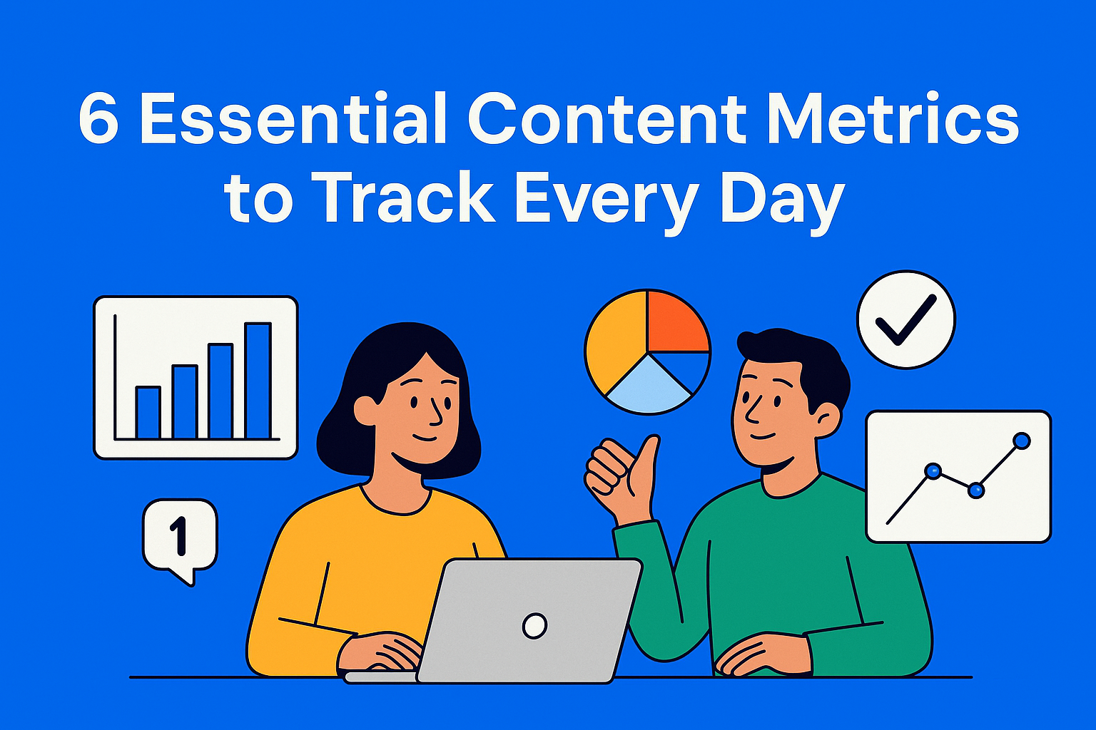
The 6 Metrics Every Content Team Should Have in Front of Them Daily
A daily content dashboard isn’t a nice-to-have, it’s how teams stay focused, move faster, and spot issues early. These six metrics give you the signals you need to plan smarter, track momentum, and make sure every piece of content actually drives impact.

If you work in a content team, you know how easily things can start moving in the wrong direction: plans shift, deadlines slip, and real problems become visible only when it's already late. That’s why a good content dashboard shouldn’t be something you open once a month. It should be a tool you look at every day, a quick overview of everything happening in your workflow.
In this blog, we’ll go through six metrics that should always be in front of you. Not because they look nice. Not because of monthly reports. But because these numbers reveal whether your content pipeline is moving, where things are slowing down, what needs fixing, and whether your work is actually pushing the business forward. These content metrics are not there to fill space, they give you daily signals for smarter decisions, faster planning, and clearer impact.
Key Takeaways
- Daily visibility prevents slowdowns - when teams track progress every day, problems show up early rather than at the end of the month.
- Pipeline health reveals hidden blockers - stages and aging immediately show where content is stuck and why.
- Revisions point to deeper workflow issues - too many revisions mean the brief, workflow, or alignment needs fixing.
- Early performance signals guide quick decisions - small daily trends help teams adjust before the month is over.
- Prioritization keeps effort focused - impact vs. effort clarifies what’s worth doing next.
- Utilization shows real business value - publishing is irrelevant if teams don’t actually use the content.
1. Content Output vs Planned Output (Realization Rate)
The first and most basic thing you should track every day is how much content you’ve actually delivered compared to what was planned. This is your baseline. It sounds simple, but most teams first notice cracks in their process right here.
This metric shows you whether the team is keeping up with the plan.
If the plan says 10 pieces per month, and halfway through you’ve delivered only 2, something is off. Maybe tasks are too big, maybe briefs are late, maybe there are too many revisions. This realization rate gives you a daily view of whether you're aligned with the plan. When you track this each morning, you immediately see whether you need to adjust workload or the process itself.
This is one of the key content planning metrics because it reveals early signs of overload or unrealistic expectations, both of which can slow down the entire content workflow.
2. Content Pipeline Health (Stages + Aging)
Imagine having 30 pieces of content in production but not knowing where they actually are. Some are in briefing, some in writing, some waiting for review, some stuck in approval. This kind of approach can easily cause issues.
Content pipeline health gives you three important insights:
- How much content you have in each stage (brief, draft, review, approval, publishing)
- How content progresses through the stages
- How long it stays in one stage, also known as pipeline aging
This “aging” matters. One piece of content can reveal a lot: if it sits in review for 9 days, that’s a signal. If it waits 5 days in brief because no one assigned it, that’s a signal. If multiple pieces pile up in one stage, that’s a signal too.
When you have this overview every day, you see whether your content workflow is moving steadily or if everything is about to get stuck at the end of the month. That’s why this is one of the most important content dashboard metrics for keeping a stable pace.
3. Revision Load (Reviewer Pressure & Efficiency)
If there’s one metric that literally saves time, energy, and money, it’s this one.
Revision load tells you how many times content gets sent back for changes. And more importantly: why.
If one piece keeps going back 3-4 times, it usually means:
- the brief isn’t clear,
- the writer and reviewers don’t share the same understanding,
- too many people are giving input,
- or the process is structured poorly.
Each extra revision slows down the team, wastes hours, and kills creativity. If the number of revisions suddenly rises, you instantly know something’s wrong. Maybe the brief needs fixing, maybe the approval chain is too long, maybe expectations need to be defined better.
Tracking this metric daily helps you improve your content workflow, reduce pressure, and speed up delivery without losing quality.
4. Content Performance Momentum (Signals, Not Vanity Metrics)
Most teams look at performance only after 30 days. But that’s too late. If you wait a month to see what works and what doesn’t, you’ve already spent time, budget, and energy.
Here, we focus on daily signals. Not big monthly numbers.
Daily signals include:
- early clicks,
- engagement trends,
- first comments,
- CTR,
- traffic spikes,
- early visitor retention.
If you see something growing in the first few days, you can promote it more, repurpose it, or push it across more channels.
If you see the opposite, you know something’s off and you can react immediately, not a month later.
This is why content metrics need to be checked daily: they help you make faster and smarter decisions.
5. Topic/Channel Prioritization Score (Impact vs Effort)
This metric helps you answer the most important daily question: What is worth doing next?
It considers two things:
- Impact (how much potential value the content can create)
- Effort (how much time and energy it requires)
When you combine these into a simple score, you get a clear prioritization guide. This helps you focus on what matters most, not what sounds interesting, but what actually delivers results.
Every day, this score helps you avoid wasting time. Instead of working for hours on something that won’t make a difference, you focus on content that moves the strategy forward.
This is a crucial part of daily content planning because it helps you make sure you're investing effort in the right things.
6. Published-to-Used Ratio (Content Utilization)
This is probably the most revealing metric when it comes to one big question: Is your team creating content that people actually use?
Many teams publish tons of content that never gets used. Sales doesn’t send it to clients. Marketing doesn’t put it in campaigns. Social teams don’t share it. And the content team thinks they’re producing great work, but that work isn’t helping anyone.
That’s why this metric is incredibly valuable. The published-to-used ratio tells you what percentage of your published content is actually being used across the business.
If you publish 20 pieces and only 4 get used, something’s wrong. Either you’re creating irrelevant topics, or there’s poor communication among teams, or the content exists only because “the plan said so.”
Tracking this daily shows you whether your content is having real impact and whether people inside the company rely on it as a tool, which is a key part of any content dashboard.
How These Metrics Work Together (Daily Decision Loop)
When you combine all these numbers into one clear, organized dashboard, you get something far more valuable than a regular report, you get a daily decision loop. And to bring all of this together more easily, you can use a tool like EasyContent, where you have a clean dashboard showing everything related to your project.

This means that every day, you know exactly:
- Recent Project Activity
- Project Execution Status
- Project Team
- Settings
- Summary
- Recent messages
This is how your content team can work in a structured and confident way - not like a group hoping everything will “somehow work out.”
Conclusion
The right metrics aren’t there to look pretty in presentations or monthly reports. Their value lies in showing you every day where you stand, what works, what needs improvement, and how your work impacts the rest of the business.
When you keep these six metrics in front of you at all times, your team works more clearly, faster, and more confidently. You’re not guessing. You’re not waiting until the end of the month to see where the issues are. Instead, you have clear signals that help you make better decisions and ensure every piece of content you create has a clear purpose.
Your dashboard shouldn’t be an archive. It should be a compass.