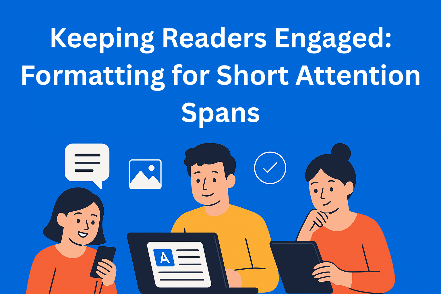
Keeping Readers Engaged: Formatting for Short Attention Spans
Discover how smart content formatting keeps readers engaged in a world of short attention spans. Learn practical tips for layout, typography, and structure that make your writing more readable, scannable, and impactful.

Nowadays, we all have shorter attention spans. We scroll, click, open, and close tabs without much thought. There’s so much information around us that our brains simply can’t process it all. That’s why people don’t read texts like they used to - they scan them. If you don’t grab their attention within the first three seconds, they’ll likely leave.
That’s why content formatting is so important. The way your text looks and how it’s organized is often more important than the content itself. A well-formatted piece can keep the reader interested, while a poorly structured one can drive them away after the first sentence (even if the content has value).
Key Takeaways
- Structure is everything - Use clear headings, short paragraphs, and bullet points to make your content scannable and approachable.
- White space = reader breathing room - Don’t crowd your text. Give the reader’s eyes a rest with spacing, images, and visual elements.
- Typography and consistency matter - Stick to clean fonts, strong contrast, and a stable visual style for a trustworthy reading experience.
- Microformatting boosts clarity - Use bold, italics, and links strategically to emphasize key points and guide attention.
- Write for humans, optimize for SEO - Prioritize readability and engagement, while blending in keywords naturally for search visibility.
Understanding Short Attention Spans
When we talk about short attention spans, it doesn’t mean people are lazy. It simply means that attention has become one of the most valuable things we have today. Every app, ad, or video tries to capture it - even for just a few seconds.
People don’t read from start to finish. They jump around the screen, looking for what catches their eye. That’s why your text needs to be easy to read, well spaced, and scannable. If your text is dense, lacks breaks, and is full of long sentences, you’ll lose your reader in seconds.
Key Principles of Formatting
1. Create a Structure That’s Easy to Scan
Most readers look at headings and subheadings first. If they like what they see, they’ll read more closely. So, use H2 and H3 headings that clearly show what each section is about.
Use short paragraphs, ideally up to three sentences. Long blocks of text look intimidating. When a reader sees a massive paragraph, their first thought is, “This is going to take forever...” - and they often give up.
Also, use lists and bullet points. They help the eyes rest and give a sense of order. Here’s a simple example:
- Short sentences feel faster and lighter.
- Lists make the text look organized.
- Each line gives a sense of progress.
This approach creates rhythm and keeps the reader engaged.
2. Let the Text Breathe
Visual breathing room is important. White space isn’t empty - it’s part of the design. It helps the eyes rest and allows the brain to process what it just read. When everything is cramped together, readers feel overwhelmed.
So, separate paragraphs and include images, quotes, or infographics. You don’t have to use too many, but they should serve as visual pauses between blocks of text. Every element that breaks up the content visually helps keep the reader focused.
3. Pay Attention to Typography
Choose a simple, readable font. It doesn’t have to be fancy, just clear. Ideally, use dark gray or black text on a light background. Contrast is key for readability. If the reader has to strain their eyes, they’ll stop reading.
Stick to one consistent style. If you use one font for headings and another for text, don’t change them all the time. People like stability when reading. When everything looks clean and consistent, the reader feels comfortable and trusts the content.
4. Microformatting for Better Flow
Microformatting means using bold, italics, and emphasis to highlight key words. It helps the reader instantly spot the main ideas. For example, if you want to emphasize a point, write it in bold. If you want to add tone, use italics.
Use links wisely. They should lead to helpful information but not distract the reader. Too many links make the text messy. Keep sentences short and clear.
Advanced Engagement Techniques
Once you’ve mastered the basics of formatting, you can add a few tricks to keep your readers even more engaged.
Interactive elements are a great option. For example, small quizzes, polls, or voting buttons. They don’t just entertain the reader - they involve them in the story. People like to be part of the content, not just observers.
Next, include multimedia content. Short videos, GIFs, or mini illustrations can make a big difference. For example, if you’re writing about travel, include a short video showing the destination you’re describing.
Another great tactic is chunking - breaking complex information into small, easy-to-digest sections. Readers love when information is presented step by step.
And if you want an extra level of connection, use mini stories. For instance, instead of saying “Use short paragraphs,” write: “Imagine you’re talking to a friend. You wouldn’t speak nonstop for five minutes, right? The same goes for your text.” These little stories help readers connect emotionally with what you’re saying.
SEO and Readability: Balancing Humans and Algorithms
A good text must be readable for both people and search engines. SEO formatting helps your content show up in search results but also makes it easier for readers to follow.
Use keywords naturally - don’t force them. For example, if you’re writing about “content formatting,” insert that phrase where it fits smoothly. It should sound natural to the reader.
Also, use tools like Hemingway Editor or Yoast SEO. They can help you check readability, sentence length, and passive voice usage.
The most important rule: write for humans, and optimize for search engines. That means your content should be clear, interesting, and useful - while keywords blend in naturally.
Conclusion
In a world where attention is measured in seconds, form becomes just as important as content. You can have the best idea in the world, but if it’s presented in a heavy, unreadable format, it won’t reach your audience.
So remember: content is king, but format is the throne. A well-formatted text not only grabs attention but keeps it. It guides the reader through the story, sets a rhythm, and creates a sense of flow.
If you want to test your text, ask yourself one question: Can this be read in 30 seconds and still make an impact? If the answer is yes, you’re on the right track.