Landing Page Content Template: How to Write Copy That Converts
Learn how to write landing page copy that actually converts. This simple template shows you what to write, where to place it, and how to turn visitors into customers, without overcomplicating things.

You can have a perfect product and a beautiful website, but if people come and do nothing, you have a problem. They come in, take a look, nod, and leave without taking any action.
That’s what happens when a landing page doesn’t have good copy.
A landing page exists to convince a visitor to do something. Buy a product, leave an email, book a call, download a free guide. One step.
And that one step depends almost entirely on what is written and how it’s written on that page.
In this blog, we’ll go through a simple and practical landing page content template, step by step. You’ll learn what should be written, where it should go, and why it works. Even if you’ve never written a single line of marketing copy.
Key Takeaways
- Strong landing pages start with audience clarity - the better you understand the reader’s pains, goals, and language, the easier it becomes to write copy that converts.
- The hero section does the heavy lifting - headline, subheadline, and CTA must quickly explain the value and next step in seconds.
- Benefits outperform features - people care less about what your product has and more about the outcome they personally get.
- Social proof removes hesitation - reviews, customer numbers, ratings, and logos build trust exactly where buying doubts appear.
- One page should drive one action - a focused CTA, clear structure, and reduced friction give the page the best chance to convert.
1. Before you write a single word - know who you’re writing to
This is the step most people skip, and that’s exactly why their copy doesn’t work.
Before you open a document and start typing, you need to know who is reading. Not “everyone”, one specific person. How do they think? What are they struggling with? What do they want to achieve?
For example, if you’re selling an online course for freelancers, your reader probably:
- Wants to work when and how much they want
- Worries they won’t have enough clients
- Isn’t sure how to price their services
Once you understand this, writing is no longer complicated. You’re just answering what that person is already thinking about and asking themselves.
A good trick is to look at reviews of similar products online, comments on forums, or social media discussions. Copywriting starts with listening, not writing. Use the words your audience already uses. That way, your copy will feel familiar and natural to them.
2. What a landing page is made of
Before we get into the template, let’s understand the structure. Every good landing page has the same core parts:
Hero section, the part the user sees first when they land on the page, including the headline, a short explanation, and a call-to-action button.
Benefits, why your product or service is useful to that person.
Social proof, proof that other people already use and love what you offer. Reviews, ratings, company logos, numbers.
FAQ, answers to questions and doubts the visitor might have.
Final CTA, one more push to get them to click or buy at the end of the page.
Each of these sections has its role. Together, they guide the visitor from “Who are you?” to “Okay, I’ll give this a shot.” That journey is the core of every good conversion copywriting approach.
3. Landing Page Content Template - step by step
Now we get to the actual template. Let’s go through each part.
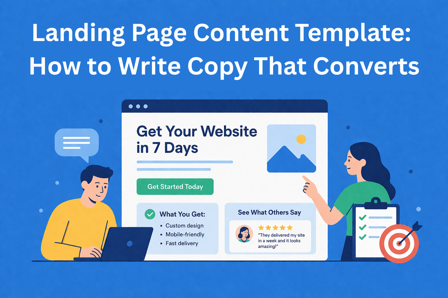
Headline
The headline is the most important thing on the entire page. Research shows that most people read the headline, and only a small percentage continue reading. So if the headline doesn’t hit, everything else is wasted.
A good headline should:
- Clearly say what you get
- Be clear, not clever
- Focus on the result, not the process
Formula: [Desired result] + [Timeframe or condition]
Examples:
- "Build your first website in 7 days, no technical skills needed"
- "More clients for your business, in 30 days or your money back"
Avoid vague headlines like "Welcome to our website" or "We’re here for you." That means absolutely nothing to the reader.
Subheadline
This is one or two sentences below the headline. Its role is to clarify the headline and add a bit more context.
If the headline is the “hook,” the subheadline is the short explanation that gives people a reason to stay and keep reading.
Example:
- Headline: "Build your first website in 7 days, no technical skills needed"
- Subheadline: "Through simple steps and practical examples, you’ll build a functional website even if you’ve never done anything like this before."
Call-to-Action Button (CTA)
The CTA is the button you want people to click. And this is where many people make a mistake, they write "Click here" or "Submit" and leave it at that.
Instead, the button should clearly say what the person gets when they click.
- Instead of "Sign up" → "Start for free today"
- Instead of "Submit" → "Download your free guide"
- Instead of "Buy" → "Reserve your spot"
One word can make a huge difference in your conversion rate, meaning how many visitors actually do what you want.
Benefits (not features!)
This is one of the most important distinctions in copywriting: features describe the product, benefits describe what the user gets.
- Feature: "The course includes step-by-step lessons and ready-made templates"
- Benefit: "In 7 days, you’ll have your first working website"
- Feature: "All lessons are short and practical"
- Benefit: "You can learn when you have time and immediately apply what you learn"
When writing benefits, keep asking yourself: "Okay… so what do I actually get from this?" If that question can still be added to your sentence, you haven’t reached the real benefit yet.
Structure of a benefit: [Feature/action] + so that + [result for the reader]
"Every week you get short video lessons, so you can learn when it suits you."
Social Proof - proof you didn’t just make this up
People trust other people more than brands. That’s just human nature. That’s why social proof is one of the most powerful elements on a landing page.
What counts as social proof:
- Customer reviews and testimonials (with name and photo if possible)
- Number of users ("Over 10,000 satisfied customers")
- Logos of companies using your product or service
- Ratings (4.9/5 based on 300 reviews)
- Media mentions
Where should you place it? Spread it throughout the page, not just in one section. Especially after the headline and before the final CTA.
FAQ - answer doubts before they ask
By the time someone reaches the FAQ section, they’re interested, but they still have questions. Or concerns. Or something isn’t clear.
FAQ is not just a list of questions. It’s your chance to remove the last barriers before someone buys.
Typical questions to cover:
- How much does it cost? Are there any hidden fees?
- What if it’s not for me? Can I get a refund?
- Who is this for?
- How long does it take / how does it work?
Keep the answers simple and direct. No need for long explanations.
Final CTA
At the end of the page, invite the user to take action one more time. By this point, they’ve read everything, and if they’re still there, they’re seriously considering it.
Remind them again what they’re getting and give them a small reason not to delay, whether it’s a limited offer or simply a reminder of why they need this.
Example: "Still not sure? Start for free, no credit card required. If you don’t like it, you can cancel anytime."
4. Principles that make copy persuasive
A few simple rules to keep in mind while writing:
Clarity beats cleverness. It’s better to be clear than to sound smart. If the reader has to think about what you meant, you’ve already lost.
One goal, one page. Don’t try to sell five things at once. A landing page has one message and one call to action.
Write “you,” not “we.” The more you talk about yourself and your company, the less interesting it is to the reader. Focus on them.
Use short sentences. Like this one. The brain processes them more easily.
5. Mistakes that kill conversions
Here’s what I most often see on landing pages that don’t work:
Too much text at once. If the page looks like a wall of text, most people won’t even start reading. Use short paragraphs, spacing, visuals.
Vague or generic CTA. "Click here" doesn’t mean anything. Clearly say what they get when they click.
Talking about yourself, not the user. "We are a company founded in 2010 with a mission to…", nobody reads that. Get straight to what the user gets.
No proof. Without reviews, numbers, or any kind of evidence, everything you say sounds like an ad. And nobody trusts ads.
Conclusion
Writing landing page copy isn’t rocket science. But it does require thinking like your reader, not like a business owner or expert.
Remember the key things:
- Know who you’re writing to before you start
- The headline is everything, invest time in it
- Focus on benefits, not features
- Add proof, reviews, numbers, testimonials
- One goal, one call to action
Use this landing page template as your starting point. Adapt it to your business, your tone, and your audience. And always test, small changes in the headline or CTA can drastically change your results.